Idea

Shape padding at 0, is not actually 0

Related products:Lucidchart
  • October 22, 2024
  • 5 replies
  • 57 views

Forum|alt.badge.img+1

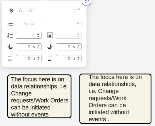
When I select 0 padding I expect the text to be hard up against the shape wall - instead it leaves a sizable padded area.  This makes the padding function useless….    The only workaround is to add a container and a text box inside it - which seems a lot of hard work.    Even if you could allow negative padding, this would avoid upsetting anyone else.  See the difference:


Comments

aparrish
Lucid Legend Level 7
Forum|alt.badge.img+15
  • Lucid Legend Level 7
  • October 24, 2024

@Paul.l I’m not quite sure if there is a question in your post. If you’re interested in viewing a similar thread, there is one here with a detailed answer: 

I hope that helps.


Amelia W
Forum|alt.badge.img+9
  • Lucid support team
  • October 24, 2024

Hi @Paul.l, thanks for posting in the Lucid Community! And that is a great resource, thanks for sharing @aparrish!

It’s worth noting that each shape will have different padding capabilities and that line width can impact padding within each shape. I would recommend adjusting your line width where possible to see if this achieves more of what you are looking for. 

However, we’re very interested in your feedback and committed to continually improving our products. I’ve converted this post to an idea so that it’s visible to others within the Product Feedback section of the community - from here, they can upvote it and add details of their own.

For more information on how Lucid manages feedback via this community, take a look at this post:


Forum|alt.badge.img+1
  • Author
  • October 24, 2024

Hi, sorry the link did not cover that at all. The fact remains that padding is broken because 0 padding should place text right next to the wall of the shape - not “padded” about 5 spaces inside it. 0 should mean 0.  Because of that we have to use the text box, as well as a shape - this we can place closer to the wall.

It’s my issue as I hate wasted space . .  :)


Amelia W
Forum|alt.badge.img+9
  • Lucid support team
  • October 24, 2024

Thanks for adding that additional context, @Paul.l. I’m glad you were able to find a workaround to eliminate the wasted space you were seeing. This feedback is shared with our product team as they consider improvements and further developments to our products.


Forum|alt.badge.img
  • November 14, 2024

As someone with a background in graphic design, I LIKE that text is not smashed up against the shape outline -- better for readability. But OP does have a point: 0 should mean 0.

I’ve noticed that padding is not applied consistently. Same number for padding in the pop-out does not always render the same from shape to shape (e.g. single outline box and double-line on sides of box only).