How do I make a pie chart? Really basic circle divided up in equal parts. Could also be a wheel.
Page 1 / 1
Hi Sylvia! Thanks for reaching out in the community. There is a way to create graphs automatically including pie charts if you are using linked data. This can be found by clicking the bar graph icon right next to where it says Data Linking on your right screen toolbar. If you are not using linked data we also have a pie chart shape found in our UI Widgets shape library. There are also two wheel type shapes found in our basic Flowchart shape library. Hope this helps!
Mason the current version does not have a 'bar graph' icon anywhere on the screen. Also there is no 'data linking' either on the diagram page.
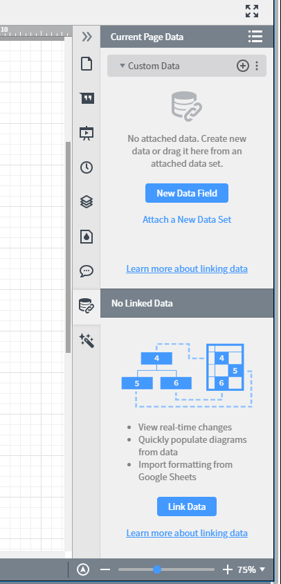
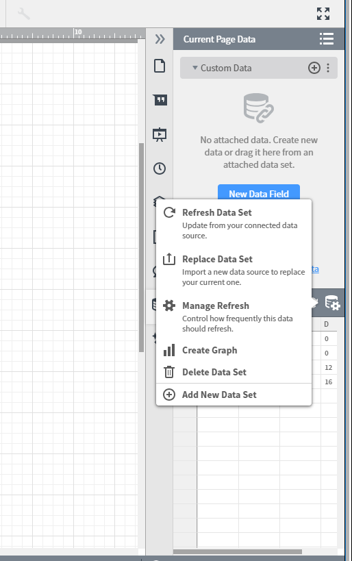
Hi Steve! I apologize the interface has been updated slightly since the last post. If you look at the screenshot below it shows where on your right toolbar you can find data linking. Then once you link data the data settings icon will appear. When you click on this (as shown in the second screenshot) you have the option to grate a graph from your data. Hope this helps!
Hi Picking this up. The only chart options it provides are line and Bar. No Pie or other normal options. Is this how it should be? or should there be other chart types please?
Unfortunately pie charts are not currently supported with this data linking interface. However this feature is still currently in Beta so if you'd like to see a pie chart option added in the future please share in our product feedback area of the community. Our team uses this form to combine like requests from users and present them to our Product team for consideration.
Hey Lucid Chart
You should really swap out that official comment. I just spent quite some time learning how to do data linking only to read through the rest of the comments and find that I cannot make pie charts through data linking.
The thread contradicts itself.
PS Love the software keep up the good work.
Thanks for the helpful feedback! I've updated the official comment. Feel free to let us know if you have any additional questions!
any updates on the pie chart dilemna? Need to pull columns vs. rows...
Hi Mary thanks for commenting on this thread. We now have a Progress Pie dynamic shape which can be used to visualize your linked data. Please see our Dynamic Shapes article for more information or click here to access an in-product tutorial. Hope this helps!
Hello @emma d
Thanks for the dynamic shapes heads up and info it looks really nice.
as far as I can see this is limited to show only "progress shapes": progress bar progress donut progress pie chart etc. on which you can only show 1 value out of a total to indicate progress completion.
is it possible to show a pie chart with multiple sections each one of them with a different percentage?
for example:
Hi Itai
Thanks for posting on the community. You are correct that our current dynamic shapes do not allow multiple sections each with a different percentage. I can see how this would be useful in Lucidchart. To explain your idea (and use case) to our development team please add it to this thread. Thank you for your request and I apologize for any inconvenience.
Any updates on a pie chart in dynamic shapes that allows multiple sections each with a different percentage?
Hi Tyler - thanks for following up on this thread. Unfortunately we do not offer this feature but I can certainly understand that it would be useful. Do you mind adding your idea to the product feedback area of the community? This feedback goes to our development team for review and we've found some of our best ideas come straight from our users!
For more information or to stay up to date on this feature please review our Help Center article on how to Visualize Data with Dynamic Shapes. Thanks for your feedback - and let us know if you have any additional questions!
Any updates on a pie chart in dynamic shapes that allows multiple sections each with a different percentage?
Hi
In case this is helpful for you or anyone else who comes across this post, here is a rundown of related features that are currently available:
- As mentioned above, dynamic shapes change dynamically based on your data. To learn more, check out the Visualize data with dynamic shapes article form the Lucid Help Center. Another helpful article is the Measure progress and track workload in Lucid article from the Lucid Help Center.
- There is a pie chart template available in our Lucid Template Gallery, but it is limited and would not provide the percentages you are hoping for.
Thank you again for taking the time to leave your feedback here.
Finally, for more information on how Lucid manages feedback via this community, take a look at this post:
https://community.lucid.co/welcome-to-the-lucid-community-15/what-happens-to-my-feedback-5438
Create an account in the community
A Lucid account is required to interact with the Community, and your participation is subject to the Supplemental Lucid Community Terms. You may not participate in the Community if you are under age 18. You will be redirected to the Lucid app to log in.
Log in to the community
A Lucid account is required to interact with the Community, and your participation is subject to the Supplemental Lucid Community Terms. You may not participate in the Community if you are under age 18. You will be redirected to the Lucid app to log in.
Log in with Lucid
or
Enter your E-mail address. We'll send you an e-mail with instructions to reset your password.