Idea

Hide settings when multiple styles are selected

Related products:Lucidchart
  • March 2, 2026
  • 2 replies
  • 18 views

Zoe H102
Forum|alt.badge.img+4

Lucidchart: The state indication when multiple items with different properties are selected is inaccurate/confusing and has led to many mistakes on my docs over the years. Standard UI app guidelines are that when multiple selected items have different properties – the shown definitions should blank-out, or are replaced by a horizontal line, so that you can visually tell that there are different settings applied to the multiple items. Samples:

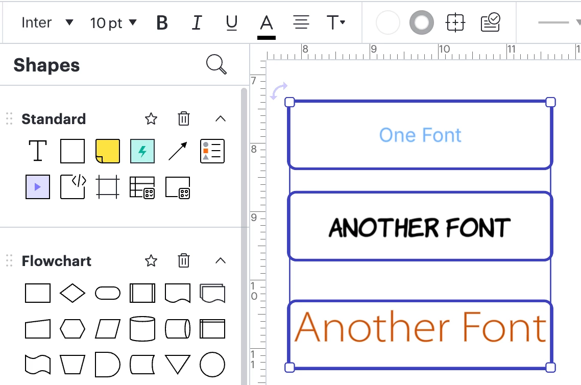
Three fonts of different sizes/colors – but the settings (if I were to follow the typical way that apps work) indicate that they are all Inter, 10pt, and black (and in fact none of these three have that setting):


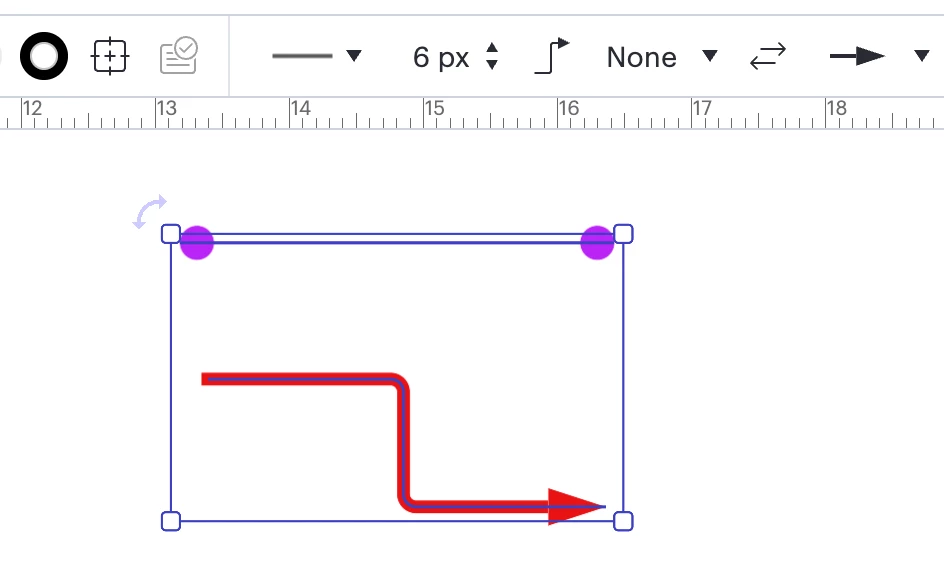
And then here are two selected lines – with the displayed settings indicating that they are black 6pt bent lines with a single arrow – and again, neither of these lines have that setting, let alone both:

When the multiple items selected that are closer in style than my above more extreme samples – it is very confusing, because users are used to UI standards showing accurate setting information when multiple items are selected – so wrong assumptions can be made that the multiple selected items do in fact have the same settings.

This is a huge problem in my opinion, and I’ve been mentioning it for years to various folks on the Lucidchart teams. Is there any chance of getting values to blank-out or have a horiz line (or even the word “mixed”) indicating differing settings, the way pretty much all other apps do? Thanks for considering!

March 3, 2026

Hi ​@Zoe H102, thank you so much for your detailed feedback on this! We’re very interested in your feedback and committed to continually improving our products.

We encourage anyone else who’s interested in this to upvote this post and share any additional details about your use case or what you’d like to see in this experience. 

For more information about how we manage feedback in this community, please take a look at this post:


Comments

Zoe H102
Forum|alt.badge.img+4
  • Author
  • March 2, 2026

There is a ton of stuff out there online supporting this as standard UI:

Core UI Standards & Principles

Designing UI for multiple selected items with different settings (mixed values) requires clear communication of state, especially when settings differ across the selection. The goal is to avoid unintended changes while allowing for efficient batch editing. 

  • Indeterminate State: When multiple items are selected, if a setting (e.g., a checkbox or toggle) has different values across the selection, display an "indeterminate" state. This is often shown as a dash - in a checkbox or a grayed-out switch, rather than a checked or unchecked box.
  • Toggle Switches (Indeterminate): Use when turning a setting on/off. If the setting varies, the switch should look neutral or "grayed out" to indicate a mixed state. Clicking it should set all items to the same new state (or, in some cases, bring up a prompt asking to merge/reconcile).
  • Dropdown/Combo Box (Mixed Value): When displaying a selection that varies, use placeholder text like "Mixed" or a blank state in the dropdown field to signify that multiple, different options are currently selected.

Ambar D
Forum|alt.badge.img+10
  • Lucid community team
  • March 3, 2026

Hi ​@Zoe H102, thank you so much for your detailed feedback on this! We’re very interested in your feedback and committed to continually improving our products.

We encourage anyone else who’s interested in this to upvote this post and share any additional details about your use case or what you’d like to see in this experience. 

For more information about how we manage feedback in this community, please take a look at this post: