May 30, 2025
Validating

Disable "tidy up" prompt on shape selection in Lucid
Related products:Lucidchart
  • May 30, 2025
  • 16 replies
  • 460 views

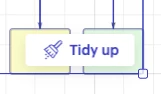
Is there a way to disable or dismiss this prompt from showing? It’s extremely annoying to have this pop up every time I select the same group of items.

Pinned Reply By jimmy

Hey, everyone! I wanted to jump in and respond to this thread because I don't it has gotten the airtime it deserves. 


I'm one of the PMs who owns this feature area. I totally get that "thank you for your feedback" might feel dismissive. Believe me, I'm on the internet, too. The feedback is helpful, though, and the aggregate of y'alls replies highlight two primary pain-points

  • This is an interaction design problem, and a fair one to call out.
  • The Tidy Up results have been underwhelming.

 In summary: The Tidy Up button is annoying & presumptive at best, and actively gets in the way of work & and is disruptive, at worst.   

Stuff that will probably be frustrating to read
I also want to acknowledge that some of the earlier comments here were written when Tidy Up's output quality was rougher than it is today.  We've made improvements (here he goes....) over the past year.  I realize, however,  that doesn't fully address what most of you are describing. This prompt gets in the way before you even get to evaluate the result.
I don't have a timeline to share for a fix on the interaction side, and I want to be honest rather than overpromise. What I can say is that your feedback -- specifically about the UI trigger and placement -- is super helpful to anchor our thinking for how we provide a better experience.

What's next?
We've actually been talking about this very thing on the team.  Again, no concrete timelines for a fix, but we're actively evaluating  ways of adding more contextual actions to the canvas.  This feedback (plus our own)  has shown us we cannot simply keep slotting buttons into people's canvas selections.   You haven't been shouting into the void. It's on our radar.  

Thanks for sticking with Lucid and being patient with us.


Pinging ​@christian-xcvo13 ​@Zoe H102 ​@lucidforceterusproducts ​@anotherc ​@jonb ​@User_Name to make sure you see this!

Comments

March 24, 2026

I find the workflow in Lucid to be very well considered, but the Tidy Up implementation is an exception. 


I think it’s a poor design choice that the Tidy Up button/element appears above a shape that I’m trying to select, often ending up capturing the click that I aimed at the shape which is now obscured by the Tidy Up element. 


If we could have an option to disable this feature in user settings, that would be much appreciated.


Thank you!


Leianne C
Lucid support team
March 26, 2026

Hi ​@jonb, thank you for continuing this thread and sharing your feedback. One quick workaround for when the 'tidy up' prompt blocks a shape: try zooming in. This shrinks the prompt's relative size, making it much easier to click the shape underneath.

If you haven’t already, we encourage you to upvote this idea post as well to show your interest in this request! Feel free to let us know if you have any additional questions. 

April 10, 2026

It is annoying that we report bugs, in your face show stopper, time wasting bugs, (menu’s removed, popups over the document asking is if we would like to ruin our work labeled “Tidy Up” are the big 2 I experience every few minutes) and instead of addressing them, we get to vote on whether they are bugs or not.

The bugs are annoying.  Having to vote on bugs to make them popular enough to garner attention instead of addressing them, is even more annoying.

April 10, 2026

Agreed 100%  Having a change triage process is fine, but not having good Product Management “sense” of how to identify when something is broken and needs to bypass usual process will cost you good will with your User Community. Mistakes happen, but poor processes can/will compound consequences.

jimmy
Lucid product team
June 17, 2026

Hey, everyone! I wanted to jump in and respond to this thread because I don't it has gotten the airtime it deserves. 


I'm one of the PMs who owns this feature area. I totally get that "thank you for your feedback" might feel dismissive. Believe me, I'm on the internet, too. The feedback is helpful, though, and the aggregate of y'alls replies highlight two primary pain-points

  • This is an interaction design problem, and a fair one to call out.
  • The Tidy Up results have been underwhelming.

 In summary: The Tidy Up button is annoying & presumptive at best, and actively gets in the way of work & and is disruptive, at worst.   

Stuff that will probably be frustrating to read
I also want to acknowledge that some of the earlier comments here were written when Tidy Up's output quality was rougher than it is today.  We've made improvements (here he goes....) over the past year.  I realize, however,  that doesn't fully address what most of you are describing. This prompt gets in the way before you even get to evaluate the result.
I don't have a timeline to share for a fix on the interaction side, and I want to be honest rather than overpromise. What I can say is that your feedback -- specifically about the UI trigger and placement -- is super helpful to anchor our thinking for how we provide a better experience.

What's next?
We've actually been talking about this very thing on the team.  Again, no concrete timelines for a fix, but we're actively evaluating  ways of adding more contextual actions to the canvas.  This feedback (plus our own)  has shown us we cannot simply keep slotting buttons into people's canvas selections.   You haven't been shouting into the void. It's on our radar.  

Thanks for sticking with Lucid and being patient with us.


Pinging ​@christian-xcvo13 ​@Zoe H102 ​@lucidforceterusproducts ​@anotherc ​@jonb ​@User_Name to make sure you see this!

Micah
Lucid community team
June 18, 2026
Updated idea statusIdeaValidating