Create animated flow in Lucidchart

Related products: Lucidchart

Hello,

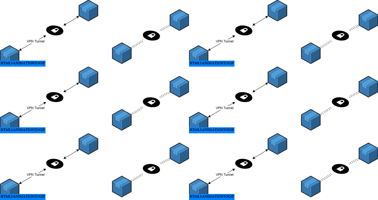
I am trying to find a way to create animated flows like it appears here: https://www.linkedin.com/posts/mendix_aws-cloudcomputing-mendix-activity-7107695715962740736-vkX_/?utm_source=share&utm_medium=member_desktop


So far, I couldn’t do it in Lucid or find any online tutorial to replicate the same. Draw.io seems able to do so using the ‘Flow animation’ property.


Thanks.

Hi @shirad

Thanks for your post! Unfortunately, this isn’t currently supported in Lucid, but we’re very interested in your feedback and committed to continually improving our products. If you’re willing to share, we’d love to hear more details about your use case or what you’d like to see in this experience within this thread.

I’ve also converted this post to an idea so that it’s visible to others within the Product Feedback section of the community - from here, they can upvote it and add details of their own.

Finally, for more information on how Lucid manages feedback via this community, take a look at this post: 


Thank you Flavia.


We build complex integration and data flow architectures based on a large array of business/technical use cases across multiple industries, and present the end to end solution to a wider team and personas, like engineers, product managers, business teams, IT, and C-Level executives, partners … etc


Many of which need to deep dive into the end-to-end architecture, and/or take quick executive decisions.


We also embed many of those architectures in our generic presentations, documentation, and knowledge base.


Having static links means that we need to spend more time explaining our solution, and answering many of the commonly repeated questions. For our documentation, this means writing more to explain the flows, while customers spend more time reading.


On the other hand, animated flows speak for themselves, and this allows the majority of the audience to quickly understand the data flows within a complex architecture.


This saves time, looks better, and is clear for all personas.


We also have been asked by many customers to animate complex solution architectures so that it’s easy for them to clearly evaluate the big picture. These architecture includes bot flows, application integration, middleware, service bus, communication protocols, data management, SSO, infrastructure design, network (VPN, VLAN, Firewall … etc), voice infra, and core technologies, … etc.


So imagine that we start with static flows in the preliminary phases, they become complex, and then we need to find a way to animate them. It’s like re-doing the majority of the work again as we need to re-align many components to fit the changed flows, versus, we apply animation from the beginning and scale as we go along.


We couldn’t do it in lucid, so we looked at draw.io and managed there at the moment.


In short, the animated flows feature in lucid will help to:


  • Quickly modernize our existing architectures without using external tools
  • Start building new flows with animation from the very beginning
  • Ensure different personas can view the big picture of complex architecture, easily


I hope this helps to get this feature built in lucid.


I look forward to hearing from you.


Hi @shirad

Thanks for providing additional details use case! 🙌  We highly value users' inputs when prioritizing improvements to Lucid! This detailed description will help promote your idea to our product team and to other Lucid users, who can now upvote it. Thanks for your contribution!


This feature would be a huge game changer for my team’s documentation. You can do animated flow arrows today in draw.io, but I love using Lucid Chart and don’t really want to use another tool. Please consider prioritizing this, even if it’s a basic version! 


Seems very similar to this idea too, right?  


Seems very similar to this idea too, right?  


IMO it’s different - the ask here is literally just to add an animation to a path (arrow, whatever). So, when you view the chart, you can see the flow diagrams in realtime.


The presentations one, would basically be a way to “step through” a predetermined flow and zoom in / highlight each part of a flow. I think the animation would go hand in hand with making a compelling presentation, but it’s separate.


The following idea has been merged into this idea:

All the votes have been transferred into this idea.

Thanks everyone for the thoughts here. This is an interesting area to us and something we could consider, but from a technical standpoint there are a few different ways we might want to go about it if we did. I’m curious from this group is anyone has thoughts on how animated flows would be most helpful? 
 

  1. When you are walking someone through a flow live (do you want to see step by step, or everything animating at once and you just talk over it in steps?)
  2. When someone is going to review a doc on their own (does this help them to be able to interpret what is happening without someone walking them through it?)

@shirad - I appreciate your detailed description above. I’m trying to make sure I understand exactly what aspects of the animation allow for “Ensure different personas can view the big picture of complex architecture, easily”. Said differently - what is it about the way the animation works (or that you want it to work) that helps make things easier to understand. 


IdeaFuture Consideration


  1. When you are walking someone through a flow live (do you want to see step by step, or everything animating at once and you just talk over it in steps?) Everything at once and I just zoom into the appropriate section(s) to focus on part of the whole story.
  2. When someone is going to review a doc on their own (does this help them to be able to interpret what is happening without someone walking them through it?) Yes. Animations help to relay state transition, e.g., egg → caterpillar → chrysalis → butterfly. Individually and without prior knowledge, these 4 phases require someone to walk through it. However, when animated, the story becomes self-evident.​​


This is much needed requirement. just to add on, I would like to see the logos also to move around.

example: a gear, can be keep rotating to show that its working. 


Thanks for your input here @Shivakumara Haadimani C! That’s a helpful example. 


  • When you are walking someone through a flow live (do you want to see step by step, or everything animating at once and you just talk over it in steps?)
    • This depends on the diagram, but the idea is to reduce the cognitive load, so practical scoping as the conversation proceeds. Sometimes the sequence matters, such as the obvious sequence diagrams or event trigger stuff. However, in many diagrams things can happen in any order and scale and therefore there is no sequence to rely on. 
  • When someone is going to review a doc on their own (does this help them to be able to interpret what is happening without someone walking them through it?)
    • Yes, as long as proper linting is obeyed. So, contextual components could lead to you guiding the user in this way.
      • For example: If a node is querying a database, which way should the arrow heads point? My personal opinion is in the direction of the flow of the data. So a basic select query I would indicate a flow of data from the database to the node. However, technically, the node sent data first to establish the query (“Select * from db.tb1”)  to return records. For me, I know that happens implicently and it doesn’t provide additional value to call that out in the diagram. So, in this case, I’ve established linting rules that say there should be one arrowhead attached or pointing at the node and not the database. If I was told that the node was authorized to write data into the database and perform select queries, I’d have an arrowhead on both ends the edge or segment. 
  • So, from Lucid’s side, as an engineer, I’d be excited about this, because there’s a whole new facet to the diagramming. Since, you’re not building dynamic diagrams, this automation along with conditional formatting could really be impactful. You could make linting rules of your own and maybe some configurable rules. Additionally, you could modify behavior based on some of that such as if one of the nodes is a database maybe the bubble that comes back is larger than other connections. Maybe a lock symbol is used when the segment is tagged as using a secure protocol, etc. 
  • I do think continuous animation is better than a single object that traverses the link. It’s easier on the eyes especially if it has a long route with a lot of elbows. Here’s an example from D2Lang for this: https://d2lang.com/tour/style#animated

@chaocipher What an incredibly helpful response! I can understand your point about cognitive load and the impact for the use case you described. Especially appreciate that example in your final bullet! This is exactly the sort of thing that will be invaluable to @kellsworth and our product team as they prioritize improvements to Lucidchart. 


This would be huge for us as a new customer.    We have to use powerpoint to create animated lines.   


@zach.mclean Thanks for joining this thread - appreciate you sharing more about your current workflow here!


Want to add a bit of context and complexity to the conversation while still being on point. I handle a lot of complex flows that are generally a mix of all kinds of styles all at once to include networking, floor plans, UEM flows, threat modeling etc. As it sits today, when get to a point where the complexity is solved with another tool, I unfortunately lean on the other tool. Our company pays for Lucid and quite honestly, I just want to have as much as I can in one spot. So with all of this in mind…


  1. When you are walking someone through a flow live (do you want to see step by step, or everything animating at once and you just talk over it in steps?)
  2. When someone is going to review a doc on their own (does this help them to be able to interpret what is happening without someone walking them through it?)
  1. This really depends on the audience at hand, obviously having options is a good thing but to help with prioritization, having everything animated at once is better in my opinion. The human mind snaps its attention to motion (source), so when walking leaders or executives through flows, I want to keep their attention on my focus areas as much as possible. Adding simple line flows help portray that motion in a self-explanatory way. As other have mentioned, there is no need to go over something specifically when the picture is literally telling it for you.
    • On the other hand - I use PowerPoint//Google Slides (like most do) to step through things that need to be in a very controlled way. Neither allow SVG files that have motion in them which is a shame and only PPTX allows SVG images at all, which is… okay. This might be a rather interesting capability.
  2. When someone is reviewing a doc on their own, the adage of “a picture is worth a thousand words” should be the base principle. Everything someone needs to review what is going should be there. Adding more text to lines or arrows gives this clarity but it does so in a cluttered way. For example, see the super quick and simple picture below. The one without motion needs to have the extra arrows and text to describe directionality, were the one with motion explains that the “flow” is bi-directional with the motion.
    • PS: Even if someone would have a question about a diagram, that is why there are those collaboration features. 😊


@Bowie This is such excellent feedback - we really appreciate you taking the time to detail how you work and providing that bidirectional flow example. Definitely understand how it would help to have this functionality directly within Lucidchart.


@Bowie - Thank you for the details. 
One quick follow up question - 

  • On the other hand - I use PowerPoint//Google Slides (like most do) to step through things that need to be in a very controlled way. Neither allow SVG files that have motion in them which is a shame and only PPTX allows SVG images at all, which is… okay. This might be a rather interesting capability.

You mention going to PowerPoint/Google slides to have more control over a presentation. If you had the ability to animate in Lucid, would it push you to using Lucid’s presentation abilities to present there, or are there too many other reasons why using those other programs would still be better? 


I guess that might depend on what those capabilities are? Doing presentations on diagrams is kinda unique and infrequent; the current Lucid > Google Slides integration works for my immediate need. Frankly, it wasn’t until you posed the question that I even gave it any thought.

Being able to create some basic animations in PPTX/Slides works but I am sure I am not the only one that said to themselves “dang, I wish I could put this animation on repeat”. (Yes, I know we could use a GIF for some things but that does not work for everything.)

Just to give some additional context… Some of the simpler presentations would just be a single diagram flow. Some of the more complex ones do that “cross type/style” I have to create anchor points to help with transitions (example: a floor plan showing host assets with network flows/relationship, transitioning to org charts for owners).