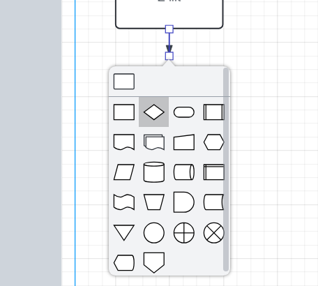
The highlighted selections (by hovering) in the above popup menu do not show a tooltip telling the user what the shape means, as it does in the sidebar menu, and this hampers productivity.
If this is a ‘popup-on-a-popup’ display limitation in the language or library, consider adding a checkbox at the top of the new shape popup menu named e.g. ‘show definitions’, that reformats the popup menu into a scrollable two-column list of:
‘<icon> | <definition>’.
This enables the speed the handy popup menu provides, but lets the user know the symbol’s name/function when close at hand while still learning the shape definitions.
As an alternative, perhaps adding a setting in the primary options to add context in a number of locations throughout the interface that accomplish this kind of additional data, rather than just on this particular popup menu.
Further still, it might make sense to have the verbose versions be the default, overridden into the terse versions in the main options with an ‘Expert’ checkbox that simplifies and streamlines the GUI for seasoned users.