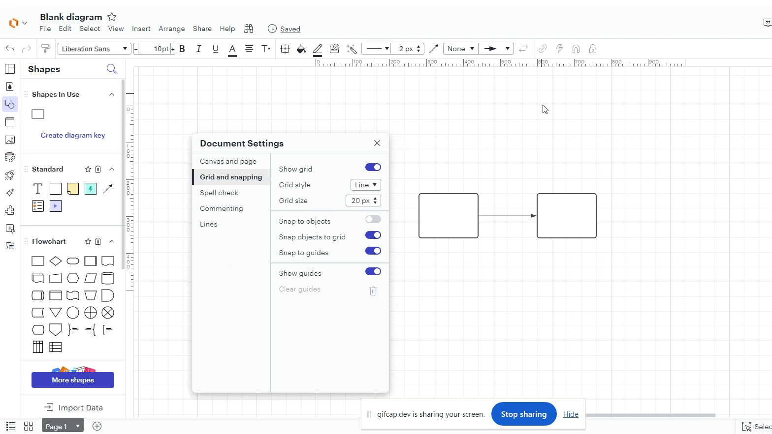
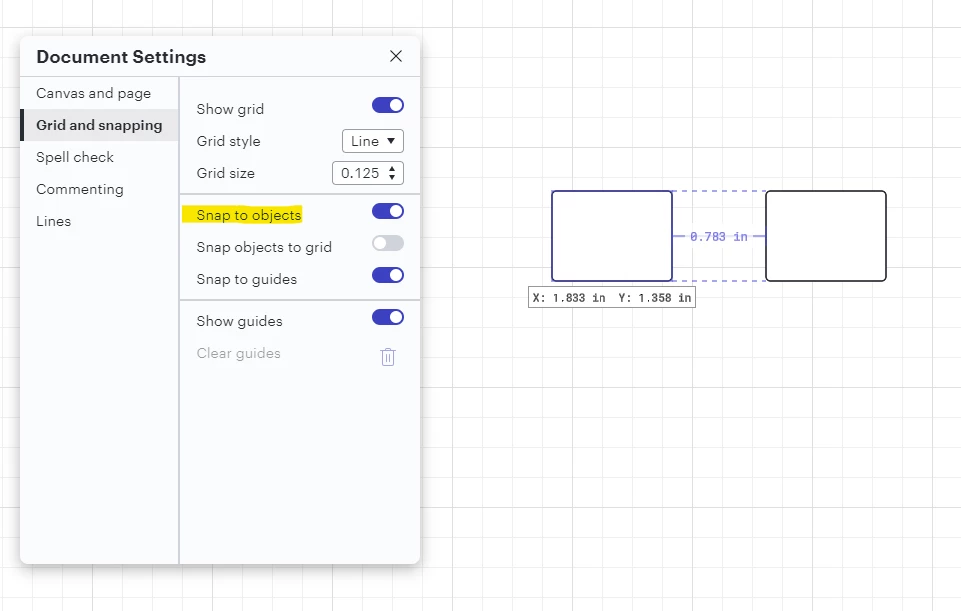
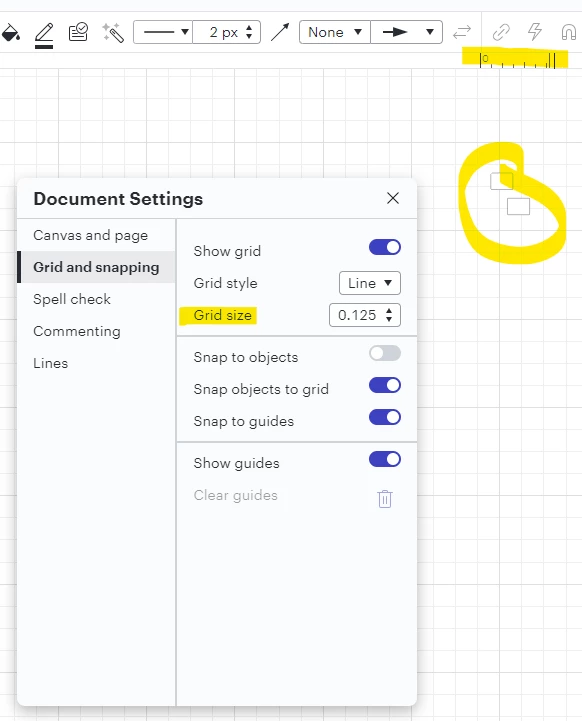
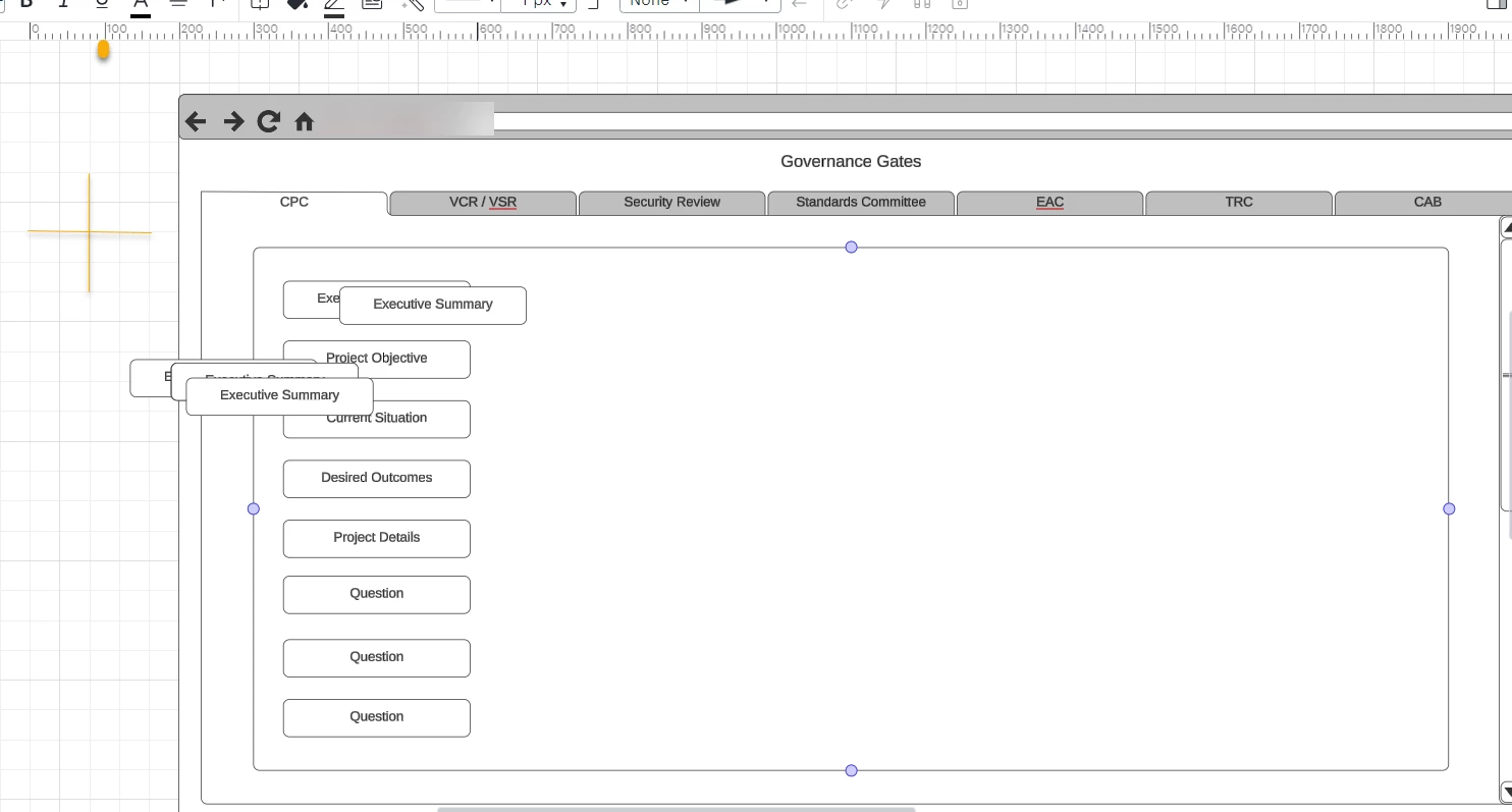
Turn Snap to grid on/off - When enabled, objects will be automatically snapped to the grid lines. When disabled, guidelines will be shown.
Currently if you are viewing gridlines, the objects don’t line up on the lines and spacing new objects to old ones is not fast or automatic. When you zoom in or out, the gridlines move but the objects don’t stick to the gridlines accordingly.
Page 1 / 1
Hi @gvasiliou, thanks for this post, and apologies for any frustration you’re experiencing. I want to make sure I completely understand your request - below I’ve clarified the intended behavior of the features you’ve mentioned and would be grateful for your insight where these aren’t meeting your needs:
Snap to grid: when this is enabled, objects snap to the gridlines as you described. When disabled, you can position shapes irrespective of the lines. I’ve demonstrated this in the GIF below:
“Spacing new objects to old ones”: I’m not entirely sure what you’re referring to here, but there are several tools related to object alignments.
The Snap to Objects setting will display lines that indicate alignment of one object to another, even if snapping to grid is disabled. However, if you do have snap to grid disabled, this will require more precise movements to align the objects, since it’s possible to position the objects regardless of the grid.
You can align multiple objects after selecting them using options in the right-click menu.
Regardless of your zoom level, snapping to grid will always apply to your objects when enabled. However, your grid size as set in your Document Settings doesn’t scale while you zoom, meaning that if you zoom out very far, your grid may effectively become small enough that it doesn’t “feel” like objects are snapping to it. In fact, they are, but the grid increments are very small.
I hope this helps clarify the intended behavior of these features. Please let me know if you’re experiencing something different!
I see what you mean. I think I might be over nitpicking then. Seems you have the functionality but here is what I see as a former product manager.
The default size is too small. Why? “it doesn’t “feel” like objects are snapping to it.” I assume you get this comment a lot? If the default size was larger, you might not get this “feeling”.
I took the text box with Executive Summary and just started copy/pasting. See how the boxes align all over and inconsistently? Not really a problem. But when you want to move them in alignment like I did with the other text boxes on the diagram, users want to align things from left to right or top to bottom quickly so that they can move on to the next task. When you zoom in and the diagram is larger like 800%, the grid in the background is enlarged also to scale, not really a problem. When you zoom out like 10-30% and the diagram is smaller, this is when the grid “appears” to not scale equally and lining up your objects becomes harder to line up quickly.
My only suggestion would be if you take the grid and divide each square into .25 or 4 quarters, when you move objects, they default into those 4 quarters or quadrants.
This is more of a user experience; I might just close this request instead of an enhancement personally but just wanted to share the pain point.
Thank you for listening.
@gvasiliou Not nitpicking at all - this is excellent feedback and we really appreciate your insight and the time you took to share all of this. I understand how these improvements would make a difference - will definitely pass along to our product team. Please keep letting us know what we can do to support your work.
Thank you. I hope I am explaining this correctly. If the default size is too small, it feels like it's not working even though it is working as expected. To over exaggerate, if the default size was .00000125. Technically its working but the measurements are so small it won’t feel like it's working.
Highest and best!
@gvasiliou Absolutely, that makes perfect sense. Thank you!
I like the idea of a scaleable grid on the opposite SMALL side. I’ve currently got my grid set at 0.125” but can’t go smaller because 0.0625” automatically rounds up to 0.063” which then shifts everything so that the grid no longer aligns with the rulers.
This becomes an issue, fox example, when I have a second wrapped line of text in a box -- 1 grid unit is too small and 2 is too big. (No, can’t change the text size, because design standards.) I’m trying to balance readability with space efficiency, and my hands get tied when I don’t have more granular control for alignment.
@k8siegel Thank you for taking the time to share such excellent detail. I understand how this would make a significant impact on your work in Lucid - noted!
A Lucid account is required to interact with the Community, and your participation is subject to the
Supplemental Lucid Community Terms.
You may not participate in the Community if you are under age 18. You will be redirected to the Lucid app to log in.
A Lucid account is required to interact with the Community, and your participation is subject to the
Supplemental Lucid Community Terms.
You may not participate in the Community if you are under age 18. You will be redirected to the Lucid app to log in.