Using Lucid for teaching Web Design

  • February 28, 2024
  • 4 replies
  • 71 views

Forum|alt.badge.img+8

I teach a unique class called The Free Web Clinic where my students make websites for real clients who want upgrades and who can then decide at the end of the semester whether to keep the new site (they almost always do). 

We’re in the design phase right now, and we use Lucid for all the things you might expect:  Wireframes, Site Maps.    Here are some wireframe diagrams my student newspaper webmasters made. 

What’s special is our “contracting process” which is how we get new clients for the free clinic.  Here’s a Lucid process chart of that process. 

We also use Lucid mind maps to help learn about new clients that have missions that are unfamiliar to us.  For example, we’re redesigning sharinghousing.org and made this mind map together before we had our first meeting with the client, based on what we gathered from their current site. 

I just wanted to share how incredibly helpful Lucidchart is to help my students’ design thinking and design communication with our clients! 

-Bram 

Comments

Brandy C
Forum|alt.badge.img
  • Lucidite
  • February 28, 2024

What an amazing, hands-on learning experience for these students! Thanks for sharing!


Micah
Forum|alt.badge.img+20
  • Lucid community team
  • February 28, 2024

This is incredible! Amazing how quickly those resources like your contracting process flowchart and client mind map helped me understand the work you’re doing, and I’m sure helps your students learn and be productive. Thanks so much for sharing!


Morgan T
Forum|alt.badge.img+16
  • Lucid support team
  • March 1, 2024

Those student examples are incredible! Thank you so much for sharing this use case!


Forum|alt.badge.img+8
  • Author
  • Lucid Legend Level 2
  • March 15, 2024

One new thing we’re doing is “User Flow Diagrams” based on the “User Stories” of our “Personas”.  These are really working well, when associated with site maps, in helping us plan out what pages our websites should have and what the wireframes should include, particularly call-outs. 

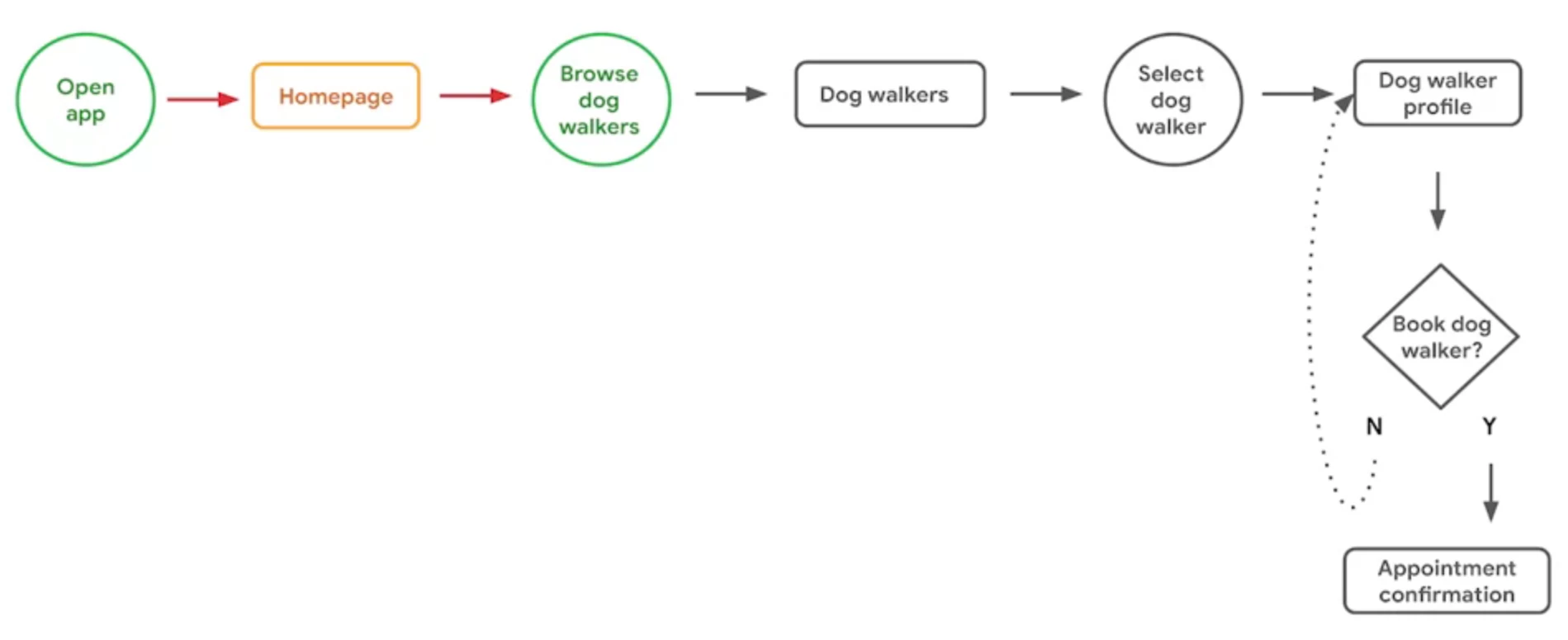
Here is an example of a User Flow diagram from Google’s UX Design Course

User Flow Diagrams are like flowcharts, but simpler: there are only three shapes: Action/Intended Action (circle), Page (rectangle) and Decision (diamond), and two kinds of arrows:  solid (movement along the flow) and dotted (indicating a loop until decision). 

There is already a “User Journey Flow” diagram in Lucid’s template list, which combines “User Flows” and “User Journey Maps” but does not use the circles that Google and other User Flow diagrams do.Lucid has a separate Journey Map template, which is similar to those used by other UX Designers, but that comes AFTER the User Flow diagrams. 

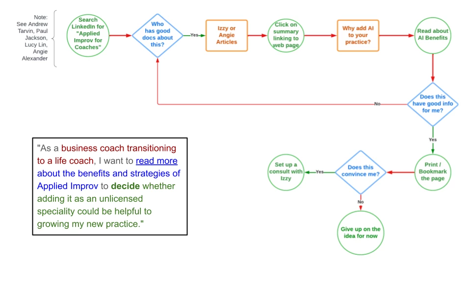
So I made my own template, saving the shapes.  Duplicate this example use.   Below is what it looks like, with the user story attached for reference.  The one thing I could not figure out was how to style the Yes and No arrows as dotted curve lines… but that’s fine.  Google is not my boss!