Question

How to arrange and style Lucidchart shapes based on imported data

  • November 11, 2025
  • 3 replies
  • 19 views

Forum|alt.badge.img+1

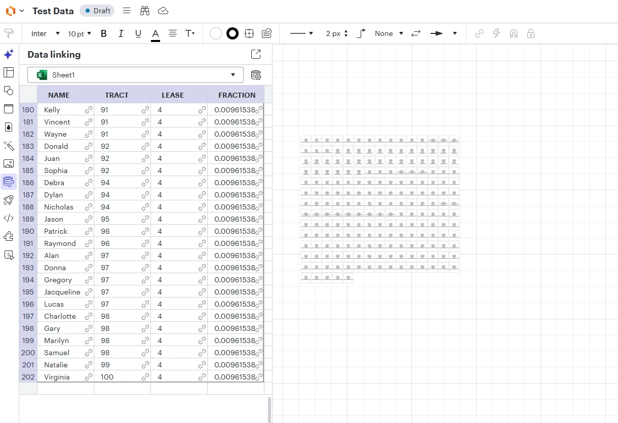
I am importing data from an excel spreadsheet into LucidChart.

I need to import several hundred rows of data into the chart.

Each row in the spreadsheet must appear as a rectangle in the chart.

Each rectangle should contain the contents of each cell in the corresponding row.

How do I set up the import so that each rectangle will be:

a) certain dimensions (or autofit)

b) a certain distance directly below the rectangle corresponding to the prior row

c) in the same order, stacked vertically, as the rows in the excel spreadsheet.


Currently the imported data appears with the rectangles arranged in an n x n matrix, instead of in a single vertical file.

Comments

Ambar D
Forum|alt.badge.img+10
  • Lucid community team
  • 1183 replies
  • November 12, 2025

Hi ​@LucidCharter, thanks for posting in the Lucid Community!

Would you mind providing a screenshot of how your imported data currently appears in Lucidchart?

If you rather not share a screenshot, could you share a temporary Document Support PIN for this document? This will help me take a closer look at what’s going on. This PIN is safe to post in this thread because it is only accessible by members of the Lucid support staff. You can find steps for generating a Support PIN in this Lucid Help Center article: Generate a Lucid Support PIN

I also first recommend reading through these resources:


Forum|alt.badge.img+1
  • Author
  • 2 replies
  • November 12, 2025


Forum|alt.badge.img+1
  • Author
  • 2 replies
  • November 12, 2025

As shown in the screenshot of the test data above, when I select the rows needed and drag them onto the lucid chart, they appear in a 2-d matrix -- n rows x n columns. I would like them to appear in a single column, in the same order that the rows appear in the imported data.