Breaking UX Conventions: The Curious Case of the "Templates" Button in Lucidchart
User experience (UX) design is a delicate balance of intuition and efficiency. When done well, it feels invisible—users navigate seamlessly, almost instinctively. But when conventions are broken without justification, it disrupts the flow, creating friction. One such curious case can be found in Lucidchart, where the "Templates" button sits in an unexpected position above the "Shapes" button in the left navigation panel. While this might seem minor, it introduces notable inconsistencies in the user experience.
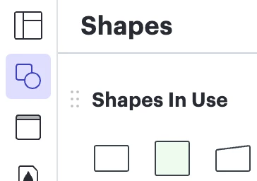
The Unusual Placement
As a software vendor, ensuring a seamless and intuitive user experience is crucial for adoption and retention. In most design tools, the left navigation houses tools that interact directly with the workspace—shapes, text, connectors, and other diagramming elements. Lucidchart follows this principle for the most part, but the "Templates" button deviates in a way that breaks user expectations.
-
Unexpected Hierarchy: Users typically expect navigation menus to follow a logical order, with frequently used, workspace-related elements placed prominently. The "Templates" button, positioned above "Shapes," gives the impression that templates are a frequently used design element. However, in practice, templates are often a starting point rather than a constant tool used throughout the process.
-
Inconsistent Interaction Model: Unlike other buttons in the left navigation that toggle panels within the same workspace, the "Templates" button opens a modal. This disrupts the fluidity of the user experience, pulling the user away from their current task instead of integrating naturally within the workflow.
-
Visual Consistency, Functional Inconsistency: The button appears visually identical to its peers in the navigation menu, but its behavior differs drastically. This mismatch creates cognitive friction—users expect it to function like the others but are met with an entirely different interaction.
Why This Matters
For Lucidchart, maintaining UX consistency ensures that users can focus on their creative workflows without unnecessary interruptions. When a UI element behaves differently from what users expect, it creates unnecessary confusion and slows down workflows. By breaking the conventional left-nav interaction model, Lucidchart forces users to pause and reorient themselves—a small but significant disruption in an otherwise fluid experience.
Potential Improvements
To enhance usability and reinforce a seamless user experience, consider the following changes:
-
Repositioning the "Templates" Button: Placing it in the top navigation (where file-related actions like "New" or "Save" typically reside) would align better with user expectations.
-
Using an In-Panel Experience: Instead of opening a modal, the template selection could appear in a collapsible side panel, maintaining interaction consistency.
-
Visual Differentiation: If the button must remain in the left nav, giving it a distinct visual treatment (such as a different icon or label) could help signal its unique function.
Conclusion
While small UI inconsistencies may seem inconsequential, they add up, shaping user perception and efficiency. By rethinking how the "Templates" button integrates with the rest of the UI, Lucidchart has an opportunity to create a more seamless experience for its users. Investing in these refinements can improve user satisfaction, increase adoption, and ultimately strengthen Lucidchart's reputation as a best-in-class visual collaboration tool.